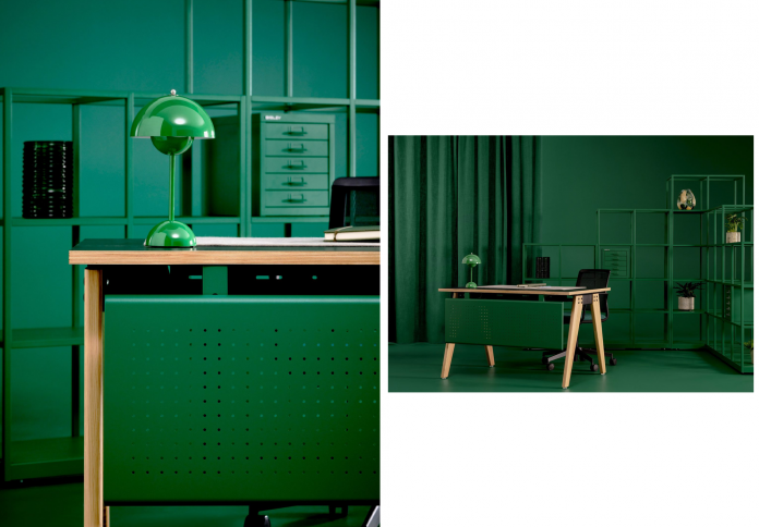
A new color can sound like the smallest possible product story, yet Bisley’s Emerald collection demonstrates how finish can alter the character of an entire design language. The British storage brand introduced the rich green tone across products ranging from its familiar steel systems to newer home and workplace pieces, unveiling the collection during Clerkenwell Design Week 2026. In Bisley’s redesigned London showroom, Emerald appeared among wood, soft textures, and earthy materials rather than as an isolated color chip. That context is the point. The finish softens the industrial precision associated with steel storage while preserving the clarity that makes the objects recognizably Bisley. At a moment when offices and homes are visually converging, the collection suggests that color is doing more than decorating furniture. It is helping old typologies move between environments without pretending they have become something else.
Green Changes the Reading of Steel
Bisley has spent decades making storage whose appeal comes partly from the logic of metal: clean edges, repeatable modules, durability, and a certain institutional directness. Emerald does not erase those qualities. Instead, the saturated green finish changes how the same geometry is perceived. A cabinet that might read as strictly administrative in gray or black can feel more domestic, botanical, or decorative without losing its structural identity.
That is the quiet intelligence of using color across an archive. The intervention is inexpensive compared with inventing an entirely new product family, yet it can reopen familiar objects for different interiors. Emerald appears on ranges including Align, Outline, classic Bisley storage, and pieces intended for the home. The continuity lets customers build visual relationships across functions rather than treating workplace and residential furniture as separate languages.

The Showroom Makes the Argument
Bisley introduced the finish in a redesigned Clerkenwell showroom under the idea of “The Layers of Design.” The space combines steel with timber, tactile surfaces, softer furnishings, and an earthy palette. Emerald works well in that setting because green has a natural ability to mediate between industrial and organic materials. It can sit beside wood without becoming rustic and beside metal without feeling cold.
Showrooms often present products at an unrealistic level of isolation, encouraging visitors to admire an object without understanding how it behaves around other things. Bisley’s layered approach does the opposite. The storage is shown as part of an environment where texture, acoustics, technology, planting, and everyday mess all have to coexist. That makes the color decision easier to understand. Emerald is not being sold as a trend swatch; it is being used as connective tissue.
The Office Is Borrowing From the Home
The timing of the collection also reflects a broader transformation in workplace interiors. Hybrid work has made the aesthetic boundary between office and home much less stable. Employees expect professional spaces to offer warmth, hospitality, and places for different modes of concentration, while homes increasingly contain serious work infrastructure. Furniture that can cross that boundary without looking misplaced has an advantage.
Color is one of the fastest ways to manage the transition. Traditional filing cabinets often signal bureaucracy because their finishes were designed for visual neutrality. A richer tone acknowledges that storage can contribute to atmosphere. That does not mean every office should look residential or every cabinet should become expressive. It means utilitarian furniture no longer has to pretend that emotion and identity are irrelevant to how a workplace feels.
Technology Sits Behind the Softer Surface
The showroom also includes Bisley’s BeSmart workplace technology, including connected locker and storage systems. That pairing prevents the new palette from becoming a purely cosmetic story. Contemporary office furniture has to manage digital access, changing occupancy, and flexible use at the same time that clients are asking for less clinical environments. The visible layer gets softer while the invisible layer becomes more technical.
This combination is likely to define many workplace products in the coming years. Users may see a warm green cabinet, timber, and textile, while behind the experience sits software determining access or availability. Good design has to reconcile those layers so that the technology does not make a space feel like a machine and the styling does not hide how the system works. Bisley’s showroom is most interesting when read through that tension.
A Finish Can Be Strategic, Not Superficial
It would be easy to dismiss a color launch as a marketing exercise. Sometimes it is. But a finish becomes strategically meaningful when it changes where and how a product can be used. Emerald gives Bisley a way to connect the company’s steel heritage with interiors that are increasingly concerned with biophilia, comfort, and visual continuity across work and home.
The collection also makes a useful case for evolution through editing rather than constant invention. Design culture often rewards novelty, even when existing objects still perform well. Reconsidering color, context, and compatibility can extend the relevance of proven forms without generating an unnecessary new typology. Bisley’s green does not revolutionize storage. It does something subtler: it allows familiar storage to enter a different conversation, and proves that sometimes the smallest visible change can create the largest shift in perception.
Color Can Be a Form of Product Editing
Applying a new finish to an established storage system may sound less ambitious than launching an entirely new object, but that modest intervention can reveal how much product perception depends on color. Bisley’s metal furniture carries associations with offices, archives, workshops, and institutional order. Emerald changes the emotional temperature without changing the basic utility.
That is particularly relevant as workplaces and homes continue to overlap. Storage no longer sits only in back rooms or under desks; it often remains visible within domestic interiors where people expect practical pieces to contribute to atmosphere. A saturated green can make industrial metal feel more intentional, even collectible, while preserving the durability and modular logic that made the original forms useful. The collection therefore demonstrates a quieter design strategy: do not redesign a proven object merely to generate novelty. Reframe it so another audience can see the qualities already there. In an industry that frequently equates innovation with new silhouettes, a color-led release can be a reminder that longevity sometimes depends on giving familiar objects another visual life rather than replacing them.