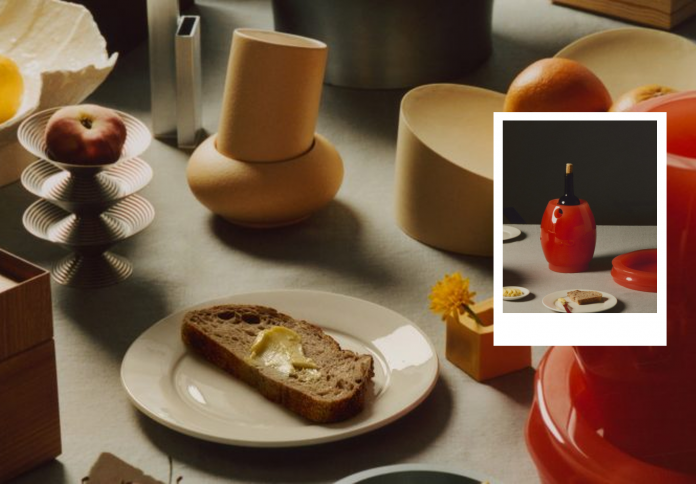
At this year’s 3 Days of Design festival in Copenhagen, the Bread and Butter exhibition brought together 12 emerging designers from across the globe to explore one central theme: the perfect pairing. Set within a Korean restaurant, the exhibition presented a curated collection of dining objects designed in complementary duos—celebrating form, function, and the shared ritual of a meal.
A culinary-inspired concept
Curated by Berlin-based studio Ae Office’s Hee Choi and Myung Nyun Kim, along with designer Pyeori Jung, Bread and Butter found its roots not in a gallery but in a restaurant. When the curators secured a space at the Korean restaurant Ouri for a pop-up show, they leaned into the culinary setting to guide their curatorial approach.
“We were thinking about what could be the perfect fit for this restaurant,” Jung explained. “And Hee came up with the idea of ‘bread and butter,’ not just as a dish, but as a metaphor for perfect pairs.” With this simple yet evocative brief—design your ideal pairing for the dining table—the curators invited 12 emerging designers from Denmark, South Korea, Sweden, and the Netherlands to participate.
The result was an exhibition that embraced both literal and poetic interpretations of togetherness. From salt-and-pepper-like forms to companion pieces that rely on each other to function, Bread and Butter played with the intimacy and interaction that design can inspire at the table.
Complementary objects with character

Each design in the exhibition embraced the theme of pairing in distinct ways. Some pairs were bound by utility, others by materials or form. Dutch studio Forever presented a raspberry-colored tray and wineholder that felt whimsical yet elegant. EO Studio, based between Seoul and Rotterdam, showcased a bread bin and matching breadboard, referencing both traditional Korean dining and contemporary design language.
The materials varied as widely as the ideas. Danish designer Anna Søgaard created stackable boxes designed for sharing food—modular and sociable in form—while Maria Bruun contributed a delicately crafted mouth-blown glass carafe and cup, resting together on a large circular coaster like two performers in a duet.
One of the exhibition’s standout pieces came from designer Hun Lee, whose balancing cups physically rely on their saucer to remain upright. “The complementary design is about the perfect pairing; one helps the other so it becomes one object,” Jung noted. This idea of co-dependence, in both aesthetic and structural terms, became a recurring thread throughout the show.
A shared color language
To unify the diversity of styles and geographies, the curators imposed one subtle yet powerful constraint: a cohesive color range inspired by the exhibition’s namesake. Designers were asked to work within a palette spanning from the creamy white of butter to the warm, toasty browns of baked bread.

This chromatic cohesion lent the exhibition a visual softness, allowing each object to speak without competing. Ae Office themselves contributed three buttery-hued pieces—a fruit bowl, candleholder, and miniature vase—that played into the theme both conceptually and chromatically.
Even when working with harder materials like metal, designers honored the palette. Laura Bilde’s ice cream bowls in stainless steel, Laerke Ryom’s cast aluminum Ripple bowls, and Krøyer Sætter Lassen’s Darwin Vase in extruded aluminum all maintained a refined, almost tactile warmth in their finish.
A global dialogue, rooted in exploration

While Milan Design Week may dominate the global scene, the curators chose Copenhagen’s 3 Days of Design for its intimacy, accessibility, and growing reputation for meaningful, design-led conversation. “We wanted to go to Copenhagen—we didn’t know why everyone was talking about it,” said Jung. “In the Netherlands, not that many people were going, so it felt like an exploration, very mysterious.”
The exhibition’s roster included designers who had never shown in Denmark before, making Bread and Butter not only a celebration of design pairs but also of cultural exchange. The setting—a Korean restaurant in a Nordic city—reflected this intersection beautifully.
Materials also crossed continents. Designer Kunsik’s Void Trays, made from mahogany and beech, referenced duality through mirrored form. Meanwhile, Munich-based Thought Progress used a unique combination of chipboard, water-soaked paper, and food-safe resin for its matching fruit bowls and vases—turning humble materials into poetic expressions of balance.
What’s next: more pairings, new places
For Choi and Jung, Bread and Butter is just the beginning. The curators envision the exhibition evolving into a traveling series, adapting its theme to different cities and spaces—perhaps even outside the traditional design venues.

“Next time we could do the exhibition in a hair salon or a bookstore, maybe a library,” the curators said. Seoul is the likely next stop, and plans are already forming to involve Korean companies and invite Danish designers to participate—flipping the cultural dynamic of the Copenhagen show.
Ultimately, Bread and Butter is less about the objects themselves than the thoughtful connections they create—between designers, materials, and diners. Whether a balancing cup, a stackable bowl, or a sculptural tray, each piece in the show contributes to a quiet but powerful conversation: what does it mean to share a table, and how can design support that everyday ritual?