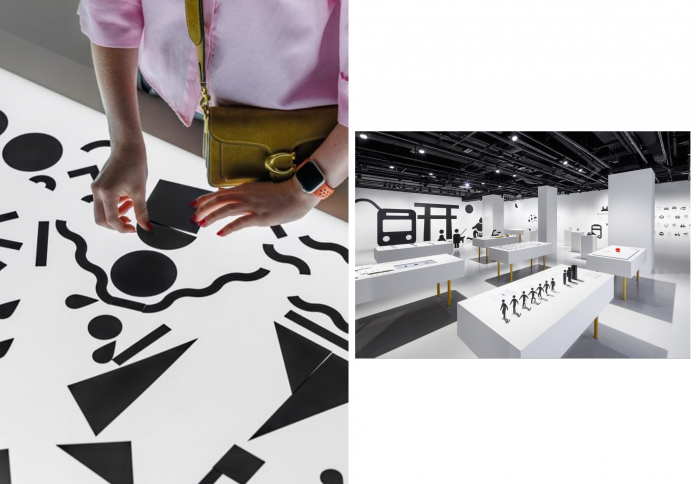
In a digital world crowded with images and information, few things cut through more cleanly than a well‑designed pictogram. From Olympic signage to airport wayfinding and smartphone emojis, the simple visual language of pictograms has become a global design staple. A new exhibition at Japan House London pays homage to this distinctly Japanese form of communication, tracing its evolution from ancient symbols to the icons that shape our everyday choices and movements.
From Olympic legacy to global design language

The story begins in Tokyo, 1964. As Japan prepared to host its first Olympic Games, designers faced a challenge: how to communicate sports, venues, and information to an international audience without relying on language. The result was a revolutionary suite of pictograms—clean, universal, and unmistakably modern. They set a global standard, influencing countless events and systems ever since.
These early icons distilled complex ideas into essential forms. A swimmer, a runner, a cyclist—each reduced to its purest motion. The exhibition showcases this legacy as a turning point in global design, marking Japan’s emergence as a leader in visual clarity and cross-cultural communication.
The design of simplicity: when form follows function

At the heart of the exhibition is a deep dive into the philosophy behind pictogram design. More than just cute or clever visuals, these icons require intense discipline: how to say the most with the least. Designers must balance legibility with beauty, making each pictogram readable in isolation while ensuring it fits harmoniously within a greater system.

Curator Daikoku Daigo, a key figure at the Nippon Design Center, emphasizes the subtlety behind this work. Every angle, curve, and negative space is considered. There’s no room for ornamentation—only what is absolutely necessary to communicate. The result is a kind of visual haiku: elegant, economical, and immediate.
An invitation to participate and play
More than a retrospective, the exhibition is also an interactive experience. Visitors are invited to create their own pictograms using modular components. Whether crafting a symbol for their neighborhood or a personal idea, participants become part of the design process—grappling with the same challenge of visual reduction and clarity.
Younger voices are also given space through the “My London Pictogram” competition, which invited children aged 7 to 16 to design their own symbols reflecting life in the city. Winning entries are displayed alongside professional work, proving that even the youngest minds can engage with the power of design.
Giant installations throughout the gallery encourage play and immersion. You can walk beneath a towering torii gate, pose like a pictogram wrestler, or sit inside an oversized metro icon. The line between audience and icon blurs, making the exhibition as tactile as it is thoughtful.
A cultural lens sharpened by design precision

The exhibition situates pictograms not just as tools of convenience but as cultural artifacts. In Japan, the pursuit of clarity, humility, and precision runs deep—from calligraphy to carpentry, from bento box arrangements to urban signage. Pictograms are simply the graphic manifestation of these broader sensibilities.
Running through autumn, the show takes place within Japan House London, a cultural hub dedicated to showcasing the richness of Japanese thinking across disciplines. Earlier this year, the gallery explored Japanese carpentry and joinery; now, it turns to graphic design with equal reverence. Together, these exhibitions form a portrait of a culture that finds innovation in restraint.
A small icon with infinite meaning
What makes this exhibition resonate is not just the beauty of the pictograms, but the reminder of what they stand for: a shared human language beyond words. In a time of fractured communication and overstimulation, there’s something profoundly reassuring about a tiny figure walking, sitting, swimming, or smiling—silent, clear, understood by all.
“Pictograms: Iconic Japanese Designs” is more than a display of symbols. It’s a meditation on the power of less, the elegance of clarity, and the enduring relevance of design that speaks without sound.