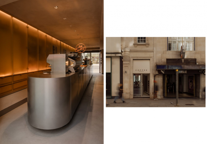
Amidst the relentless pace and bustle of London’s Holborn Underground Station, the architectural firm EBBA has designed the new Joe Blake’s coffee shop as an architectural intervention—an inviting, “ephemeral refuge.” By restructuring a space that was previously a dry cleaner, designed purely for transactional purposes, EBBA utilized warm color tones and soft surface treatments to create a relaxed atmosphere that stands in direct opposition to the surrounding noise and hurry. The design focuses on subtly expanding the visual space and optimizing passenger flow, transforming the compact coffee kiosk into a highly aesthetic space. It serves both the daily need for a quick energy refill and the desire for a moment of stillness within the busy city, proving that thoughtful design can redefine the urban experience even within the tightest constraints.
Design Context: Contrasting Urban Commotion
The central challenge for EBBA when designing the fifth location for Joe Blake’s was its context: a small, confined space situated inside one of London’s busiest tube stations, Holborn.

The original space, formerly a dry cleaner, possessed a purely functional and transactional layout, offering no invitation for patrons to pause or relax. The goal shared by Joe Blake’s and EBBA was to create a distinct contrast: transforming the area into a quiet, “architectural moment,” a place offering coffee as a “quick restorative fix” for commuters. EBBA began by making modest but critical structural changes. They focused on reconfiguring the internal arrangement to foster a sense of openness, carefully adjusting the flow between the street-facing façade and the service counter. By blurring transactional boundaries and subtly expanding sightlines, they made the kiosk feel more accessible and engaging, elevating the customer experience from a simple service point to a momentary sanctuary.
Contrast with the surrounding environment was a core principle. Where commuters are typically surrounded by stark lighting, noise, and urgency, Joe Blake’s was designed to offer warmth, muted colors, and soft lighting. This intentional contrast helps Joe Blake’s become a psychological rest stop, where customers can briefly tune out the chaos of the subway station and enjoy their daily coffee ritual in a controlled and pleasant environment.
Material Palette: Milky Softness and Mineral Surfaces
EBBA’s design is distinguished by its use of a highly limited yet strictly controlled material palette, which strikes a balance between a sculptural minimalism and organic warmth.

The central material focus is a combination of metal and plaster. The key feature of the space is a circular central counter made of stainless steel. This metal, often associated with coolness, is subtly used to anchor the room and highlight the skillful craftsmanship of the baristas as they prepare coffee. Surrounding the bar, the walls and ceiling are finished in a sandy-toned plaster, a warm, natural hue that helps to absorb light and create a softened atmosphere. The interplay between the sleek stainless steel and the rugged plaster creates a delicate material contrast, enhancing the sense of proportion and form within the narrow space.

Another unique material detail is the use of “milky” surfaces for the storage cabinets and partitions behind the counter. This matte, slightly translucent finish is employed to discreetly conceal stock, clutter, and merchandise, creating visual privacy. It allows a hint of light to pass through and softens the visual noise, maintaining the clean and tranquil spatial composition. The use of milky material, as a nod to coffee, is also a subtle reference to EBBA’s inspiration from modern apothecaries, where products are displayed but kept in control and order.
Lighting and Visual Illusions
In a space constrained both horizontally and in depth, EBBA employed clever design techniques to visually expand the sense of space and optimize illumination.

Lighting is fully integrated into the architecture to avoid the distraction of visible fixtures, which could disrupt the space’s tranquility. Lighting is hidden in ceiling coves and under counter edges, providing a soft, diffused illumination that simultaneously highlights the sculptural surfaces of the bar and the plasterwork. This warm lighting is a key factor in achieving the “relaxed mood” that EBBA aimed for. The use of indirect lighting not only enhances the aesthetic but also helps to minimize visual fatigue, allowing customers a true moment of respite.
To address the long, narrow floor plan, EBBA installed a large mirror on the back wall of the coffee shop. This technique instantly makes the space appear significantly longer, creating an illusion of depth and enhancing brightness. An orange decal of the Joe Blake’s handwritten logo is applied to the mirror surface, adding a bright, unique color accent. The combination of soft light, pale plaster, and the space-magnifying mirror transforms the coffee shop into a compact sculptural moment, defined by the strict control of form and light.
Sculptural Minimalism and Community Function
The design of Joe Blake’s Holborn is a prime example of sculptural minimalism, where the focus is placed on form, proportion, and material contrast rather than elaborate decorative details.

The spatial arrangement and integrated furniture are designed to direct movement and foster interaction. The central circular stainless steel counter invites circulation around it, turning the coffee preparation process into a small “stage.” Integrated banquette seating and benches are positioned along the periphery of the narrow floor plan, respecting the geometry of the space and guiding movement from the entrance to the preparation area in the back. This controlled arrangement ensures that even during peak hours, the flow of customers remains smooth and orderly.
Furthermore, the design emphasizes the coffee shop’s role as part of a daily ritual. Joe Blake’s is positioned as an essential service, a contemporary parallel to a classic apothecary, where the product (coffee, pastries) is the quick remedy. By keeping service and storage areas visually concealed, EBBA succeeded in maintaining a quiet and refined spatial composition. The minimalism here is not cold; instead, it fosters an intimate, restful atmosphere through a high degree of focus on surface texture, proportion, and the interplay between mineral materials (steel, concrete) and warm tones (sandy plaster).
