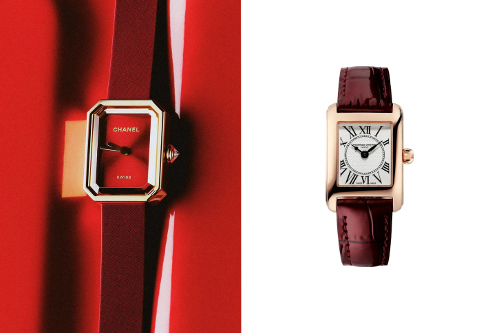
Burgundy changes a watch differently depending on where it appears. A saturated dial places the color at the center of every glance; a leather strap lets it frame a more restrained face. The Reverso Tribute, Ferragamo Asymétrique, Frédérique Constant Classic Carrée, NOMOS Metro 33 muted red, and Breitling Navitimer show how several related shades can inhabit sharply different forms. Case shape and the placement of color provide the comparison’s starting points. Rectangle, angled case, small seconds, and circular dial each organize the color in a particular way. Within a palette often associated with autumn dressing, these objects offer a more specific question: how much of the watch should carry the warmth, and what does the surrounding structure ask that color to do?
The Reverso Gives Red an Architectural Border
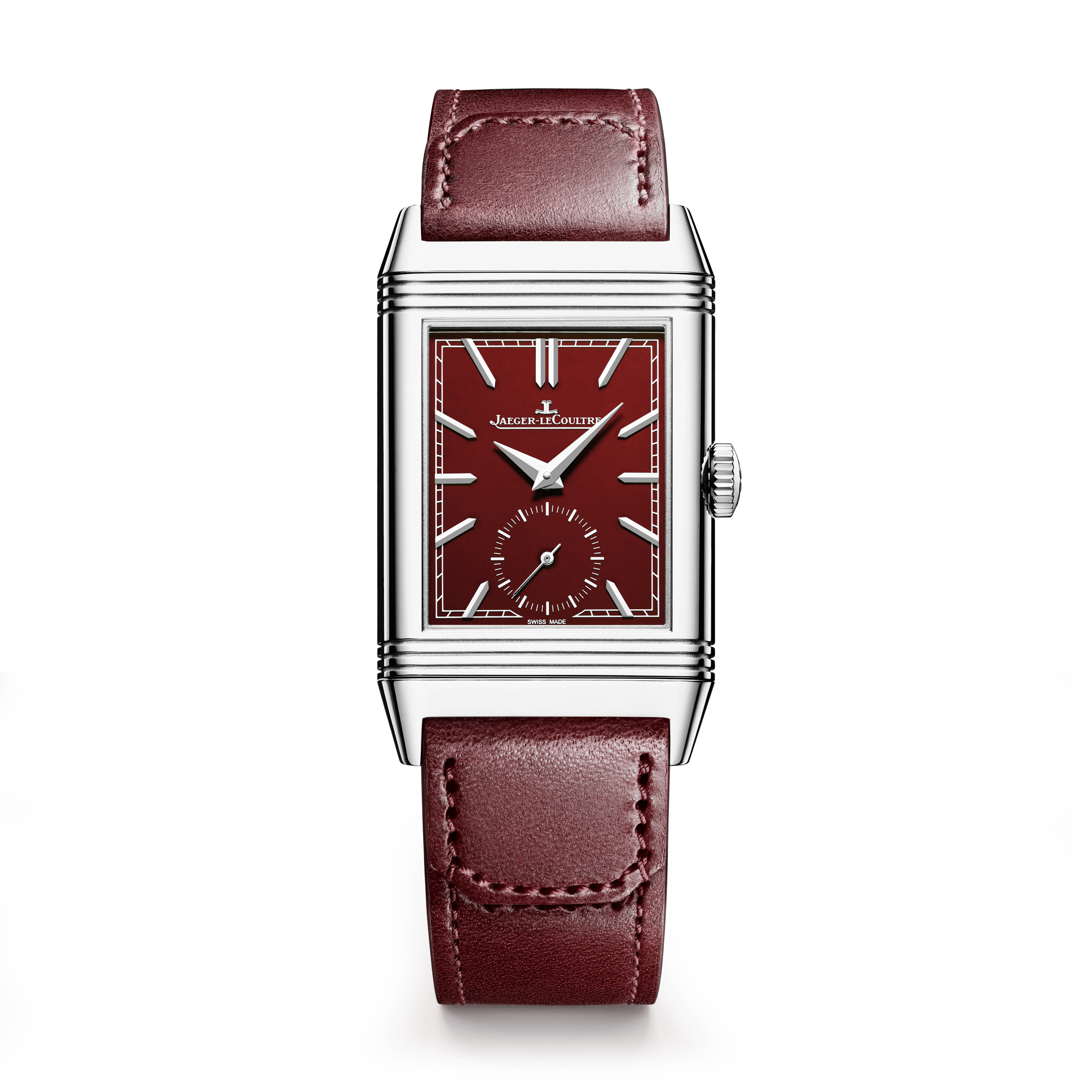
Jaeger-LeCoultre’s burgundy Reverso Tribute Monoface Small Seconds places saturated color inside the model’s elongated geometry. The dial’s rectangular field and applied markers hold the saturated dial inside a clearly drawn boundary. A small-seconds display introduces another scale within that field, adding a separate point of motion without surrendering the overall order. The effect is materially different from a large round red dial. The case’s lines give the warm shade a structured setting, one in which proportions remain especially visible.
The Reverso’s history begins in 1931, with a reversible case developed in response to the demands of polo. That construction is more than an Art Deco visual reference. It gives the watch a mechanical action through which one face can be protected and another surface revealed. In a current design, the historic mechanism remains part of the object’s identity even when the color supplies the first impression. A burgundy dial changes the mood without changing the underlying idea of a case that turns.
Ferragamo Tilts the Familiar Rectangle
The Ferragamo Asymétrique introduces an angled case into the language of a leather-strap watch. The shape makes the object feel less predictable even before the color enters the comparison. A rectangular watch usually establishes a clear relation to the direction of the strap. An asymmetrical outline modifies that alignment, giving the eye a small geometric interruption. Burgundy leather then adds warmth around a form whose visual interest depends on its refusal to be entirely regular.
Color and geometry are performing different jobs here. The strap connects the watch with the deeper reds used in clothing and accessories, while the case supplies the more distinctive structural detail. That separation helps explain why the design does not need a heavily ornamented dial to remain recognizable. A small object has limited space in which to establish its identity. Concentrating the unusual feature in the outline allows the rest of the composition to remain comparatively restrained.
Carrée Keeps the Dial in a Different Register
Frédérique Constant’s Classic Carrée Ladies pairs a rectangular case and Roman-numeral dial with a deep-colored strap. Burgundy runs along the wrist, leaving the dial’s lighter field to display the numerals. This gives the watch a different balance from the Reverso example: the strap acts as a frame, while the dial maintains another visual register. The color can coordinate with a wardrobe without requiring every glance at the time to pass through a saturated field.
That placement is particularly consequential on a smaller watch. A strap occupies visible length along the wrist, while the dial concentrates detail into a compact area. Burgundy can therefore have a substantial presence even when the face itself is pale. The proportions determine whether the color reads as the object’s main identity or as an accent. The distinction is more informative than treating every watch with a wine-colored component as if it were the same design in a different brand’s catalog.
Metro’s Red Is Deliberately Softer
NOMOS’s Metro 33 muted red uses a quieter dial shade, pink accents, and a gray velour strap. The combination moves away from the richer leather-and-burgundy contrast. Red becomes a softly colored field within a contemporary graphic arrangement. The small-seconds area supplies a detail at close range, while the gray strap keeps the surrounding frame relatively neutral. A watch can therefore participate in the wider red palette without adopting the density usually suggested by words such as oxblood or wine.
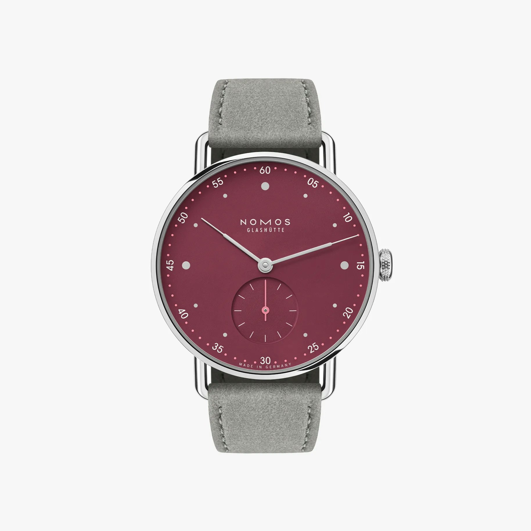
The model is hand-wound, giving its daily use another point of contact beyond reading the dial. Winding is a practical interaction with a mechanical object, not proof of a more authentic relationship with time. It simply places a small action within the wearer’s routine. The Metro’s restrained color and visible design details can be considered beside that action, joining the quiet dial to a small recurring action at the winding crown.
Navitimer Lets the Strap Carry the Season
Breitling’s Navitimer Automatic 36 pairs a pale dial with a deeper leather strap in the version considered here. The circular face and the model’s aviation associations distinguish it from the more architectural rectangles. The strap softens the overall impression by supplying a warm boundary around a face with its own established visual identity. In the Navitimer, the strap provides the seasonal shade while the round face keeps its established structure.
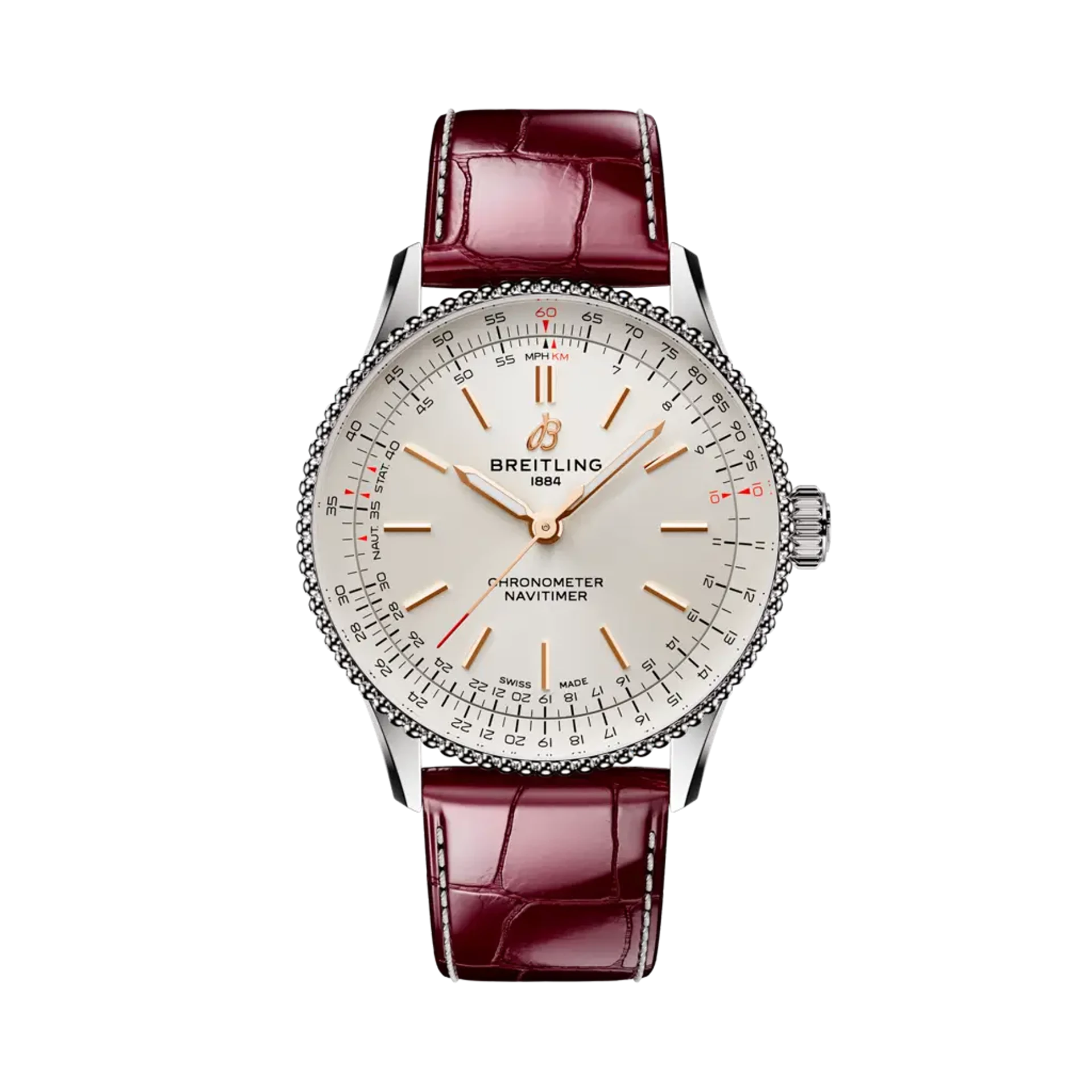
Placed beside the Metro, the contrast becomes clear. One locates muted red in the dial and gray around it; the other allows a pale dial to sit within darker leather. Both can join a seasonal wardrobe, but they organize attention in opposite directions. The comparison does not require a judgment that one is more tasteful. It asks the viewer to identify where the color resides and how much of the object’s character it is expected to carry.
Five watches thus produce more than five versions of the same trend. Reverso contains the color within strict lines, Ferragamo angles the case, Carrée lets the strap frame a traditional dial, Metro softens red through a graphic palette, and Navitimer keeps the warmth at the edge. A wine-colored watch begins as a small accent, but its placement determines how the whole object is read.